Professional Squarespace and WordPress Redesign Services
Think of us as Queer Eye for websites but with less tears…
I live for clean, modern design that is easy to navigate. Sites that are clear of clutter and allow images and concise text to tell your story and engage with your intended audience. The goal is to create a flow that feels natural, inviting and responsive to various screen sizes and mobile.
Top Tips for Redesign Projects
-
1. It's all about the space.
The content of your website needs room to breathe but not an entire room. In the example above, look at the excess white space in the Master Nail Class site. Removing the white space allowed us to showcase her stunning work and move up the navigation for a better user experience (UX).
-
2. Use your assets correctly.
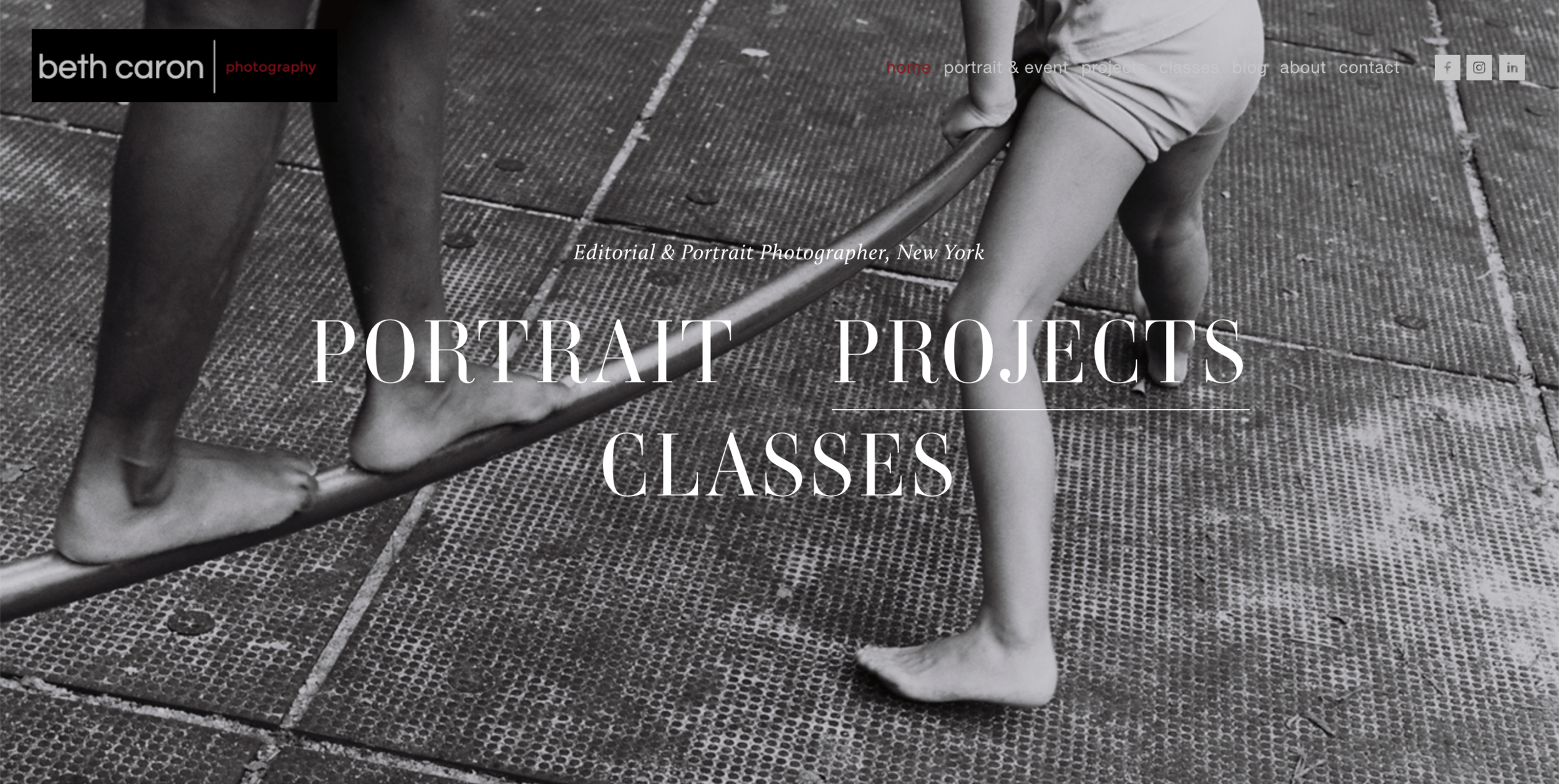
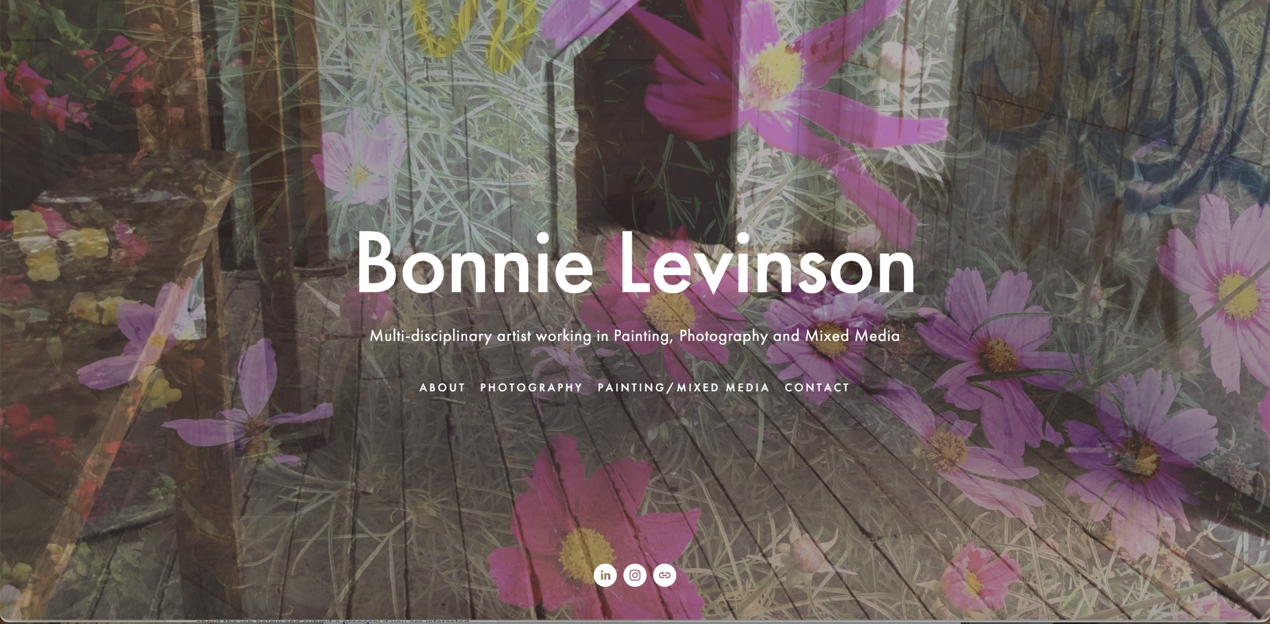
If you have great images, use them properly to best highlight your brand. Look at the difference in impact of the exact same image in Kalo Karma. You can also see images that are cut off above the fold on the Bonnie Levinson and Hillsdale sites. Avoid making someone scroll to see the full image. Besides, no one wants to be cut off at the belly button 🤣
-
3. Less is more.
You want your site to express your personality but excessive use of colors and fonts can distract from your message and the overall goal of your site. Rascal Ranch and Bill O’Connell are great examples of before and after.


